


-
Ar
chevron_right
Microsoft shares its process (and discarded ideas) for redone Windows 11 Start menu
news.movim.eu / ArsTechnica • 13 May 2025 • 1 minute
Microsoft put a lot of focus on Windows 11's design when it released the operating system in 2021 , making a clean break with the design language of Windows 10 (which had, itself, simply tweaked and adapted Windows 8's design language from 2012). Since then, Microsoft has continued to modify the software's design in bits and pieces, both for individual apps and for foundational UI elements like the Taskbar, system tray, and Windows Explorer.
Microsoft is currently testing a redesigned version of the Windows 11 Start menu , one that reuses most of the familiar elements from the current design but reorganizes them and gives users a few additional customization options. On its Microsoft Design blog today, the company walked through the new design and showed some of the ideas that were tried and discarded in the process.
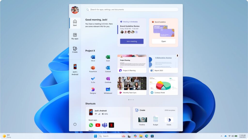
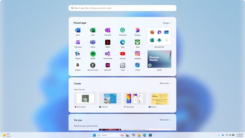
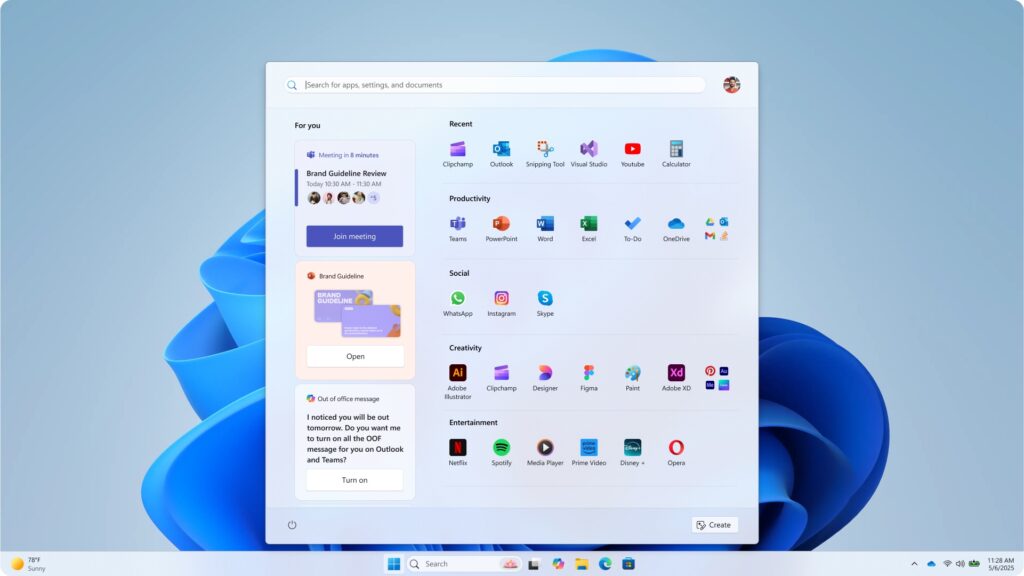
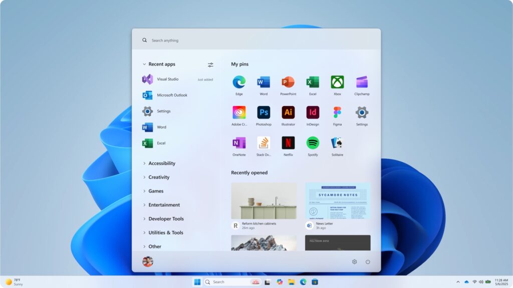
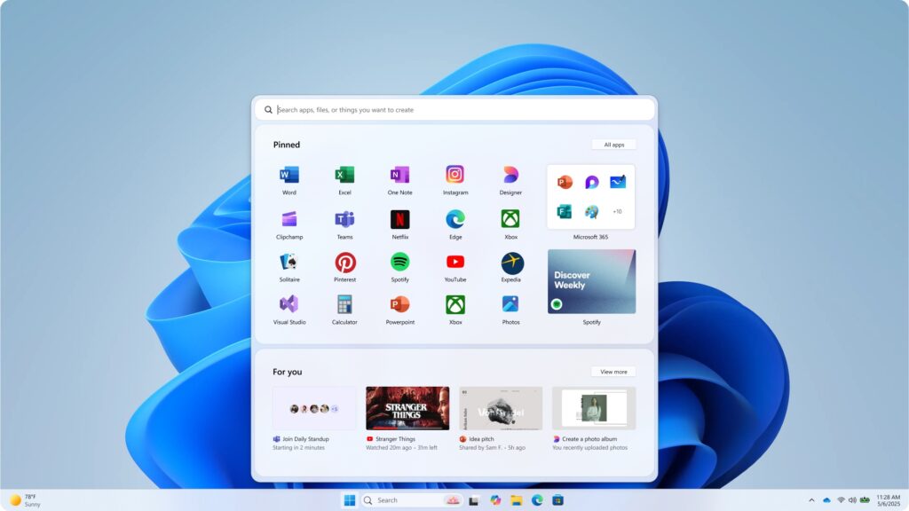
Microsoft says it tested its menu designs with "over 300 Windows 11 fans" in unmoderated studies, "and dozens more" in "live co-creation calls." These testers' behavior and reactions informed what Microsoft kept and what it discarded.